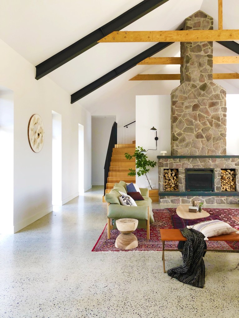
A pop of colour on white walls is an easy, inexpensive way to transform a space. Interior stylist Jono Fleming’s family farmhouse originally had white walls – the idea was to use them as a blank canvas to showcase the grand stone fireplace, cathedral pitched ceiling and exposed timber beams. But in a room so big, the space felt cold and sterile, despite the textural furnishings introduced to try and soften the space.
The solution? Jono introduced a classic navy hue to transform this hub of the home. “By painting the wall I’ve entirely changed the feeling of the space and demarcated living zones, in what was once an expansive open plan room,” he says.
How to achieve the look
“It’s all about small steps when it comes to using colour throughout the home,’ says Jono. “I recommend starting with the main colour you’d like to introduce and build out from there.”
“I used the dark kitchen and red Persian rugs that had deep blue patterning as my starting point for building the palette. Blue hues are fantastic to use in living areas – they provide a feeling of comfort and understated elegance, plus there are endless colour pairings. Painting an entire wall navy might seem like a big jump from white, but when the rest of the decor and furniture are complementary the colour is considered.”
“When putting final touches to the space, I chose an abstract artwork filled with deep blues, blacks and greys, which tonally works with the wall colour, the navy in the Persian rugs and polished concrete floors. To add some drama, we used natural ceramics and an abundance of luscious greenery.”

Jono’s tips when using colour
Start with a rug or artwork. Take your colour cues from a key painting or rug to give your room’s scheme an intentional feel – work within this palette. Also, choose colours you love and that are liveable to you!
Open plan spaces can be ‘zoned’ using colour; consider which wall will help ground and delineate the space.
There are endless colour combinations with navy. Jono paired Porter’s Paints Yacht Race with red, sage greens, polished concrete, white and blonde timber, although he says it would have also worked beautifully with ochre and mustard tones.
Always start using sample pots, painting large swatches in designated areas so you can live with the colour for a few days and see how it performs under changing light conditions.

